Here's a
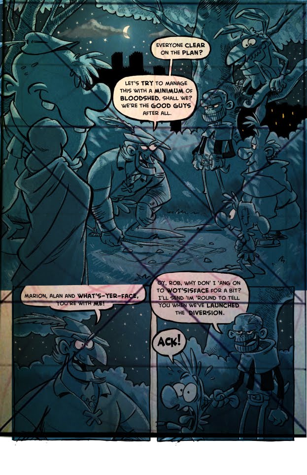
fascinating article about layout composition as applied to the classic comic strip Tintin. After reading it, I was curious about how much my own work follows those aesthetic principles. So I grabbed a pic from the article and layered it over some of my favorite pages from book 3 and look what I found out:


The thing I find interesting is that none of this was intentional. I didn't know about dividing the page into squares, circles and triangles, I just juggled the elements around until they "looked right". What this tells me though, is that it's possible to quantify what "looks right". These are of course just some of my favorite pages, and I haven't checked to see if all my pages conform, I'm sure they don't. But it's nice to see that when I think it's working, I can actually prove it.


 The same layout template applied to Leiji Matsumoto's Captain Harlock, Katsuhiro Otomo's Akira and Akira Toriyama's Dr. Slump. This relates to: The Comics Journal.